Tuesday, June 30, 2020

Corpus Christi Takes Off

My wife and I love spending our winters in Corpus Christi, Texas, so we're following what's going on there somewhat closely. The most recent data are shocking, as this graph illustrates:
The graph is from the TAMUCC-COVID19 task force report, which is worth a look. 

Note that the positive rate for the tests has gone up very rapidly, and now is above 30%. That indicates that not enough tests are available, which is confirmed by a news report (note the word "tests" is missing after "nucleic acid"). 

The city of Corpus Christi reports 274 new cases today (6/30). How does the situation compare to New York City in March?

The county that Corpus Christi belongs to, Nueces County, has a population of about 360,000. The NYC population of 8.4 million is has about about 23.3 times higher; adjusting the Corpus Christi numbers to the NYC population gives about 6,400 cases per day. The highest number of daily new cases that NYC reported was 6,376 cases on April 6. For the same day, NYC reported a positive rate of 57%.

A big difference between NYC and Corpus Christi is the age distribution of the people testing positive for COVID-19. In NYC, the 75+ group had the highest number of reported cases, about twice as many as the 18-44 group.  In Nueces County, the groups of 20-39 year olds had the highest per capita rate. Part of this difference may be due to extremely limited testing in NYC, where testing was largely limited to patients with severe symptoms; but it is likely that a more important reason for the observed difference is linked to behavioral differences.

In view of the lower positive rate and the differences in the average age of persons with a positive test result, Nueces County is not yet in as critical a situation as New York City was at the beginning of April. But is must be noted that the peak in infections in NYC was observed almost two weeks after a strict stay-at-home order had been issued, which was enforced by police. In contrast, the order issued for Texas is just a small rollback from near-complete reopening; for example, restaurants are allowed to remain open at reduced capacity, and public meetings up to 100 people are allowed, with no limits on meetings for religious purposes, sporting events, and many other exceptions. The Nueces County judge has issued a "Facial Coverings Required" order, but it applies only to some government buildings and most stores with the qualifier "when in a space that will necessarily involve close contact (areas where six (6) feet of separation is not feasible) with others". But effectively, this is only a recommendation, since paragraph 10 of the order states:
"Consistent with Abbott's Order, no civil or criminal penalty will be imposed on individuals for failure to wear a face covering."
In view of strong opposition that many Texans have displayed against using face masks, it remains to be seen how effective the order will be. If it is ignored by a significant part of the population, it is likely that the infection rate in Corpus Christi will reach or exceed New York City levels. Initially, the rate for deaths from COVID-19 in Corpus Christi is likely to be lower, since mostly younger people are currently infected. But over time, the infections will likely spread to all age groups more evenly, which will result in a corresponding large increase in COVID-19 deaths.

Sunday, June 28, 2020

COVID-19 Deaths: A Closer Look

How many deaths does COVID-19 really cause? As I explained in a previous post, "excess mortality analysis" is a good way to answer this question that avoids problems like missing tests, wrong test results, and incorrect classifications of death. This is an updated look at the excess deaths in the US, and how the number of excess deaths compares to the number of officially reported COVID-19 deaths. I'll start this post with results; details about how the results were calculated are given further below in the post.

Excess deaths in different US states


The graph above shows the excess deaths in the states were affected strongly by COVID-19 early in the pandemic, and later showed decreases in reported COVID-19 deaths, for the weeks ending 3/7 tp 5/16/2020. The numbers shown are the percent of excess deaths, above and relative to the expected deaths for a given week, based on averages from the previous 5 years. For example, New Jersey reported a total of 4,735 deaths for the week ending 4/11, compared to the typical average of 1,441 deaths. The excess of 3,294 deaths is 229% of the expected deaths count. Other states shown in this graph had between about 35% (Colorado) and 150% (New York) additional deaths in the worst weeks.

For comparison, here is a look at "late" states that generally showed a later increase in excess deaths, and no or minimal declines:
There are more states in this list, but the relative increases in deaths are smaller: between 10% and 60%.

The graphs above only extend to 5/16 since too many death report data for recent weeks have not yet been submitted to the CDC. For the weeks shown, most states have reported more than ~90% of the actual deaths, and the CDC spreadsheet tries to estimate the number of missing reports based on historical reporting patterns. However, the CDC estimates are "lowball" estimates that under-predict final numbers, so they cannot be used for the most recent weeks.

Overall, 26 states shown in the graphs above have reported increases in overall mortality between 10% and more than 200% for several weeks in the analyzed time period. Note that the graphs above omit most smaller states because the week-to-week variation in deaths is much larger.

States differ in "COVID-19 death reporting ratios"

In a "theoretically perfect" world, everyone who dies of COVID-19 would be tested for the virus in time, have a positive test result, and therefore have COVID-19 listed on the death certificate; at the same time, nobody who died of other causes would have COVID-19 listed. But tests can fail; people can die alone at home, without ever being tested for COVID-19; doctors and medical examiners can make errors; and other things can go wrong. Looking at the ratio between reported COVID-19 deaths and the number of excess deaths can give a quick impression which of these factors dominate. Here's a graph for all states that reported more than 500 COVID-19 deaths for the 10 weeks  3/14 to 5/16/2020:
Three states have reported more COVID-19 deaths than excess deaths: Connecticut, Washington, and North Carolina. For Connecticut and North Carolina, this is due to very slow reporting of death certificates (see the "Methods" section below).  Washington reported 999 COVID-19 deaths and 12,349 total deaths for the 10-week period, which amounts to 882 excess deaths. It is likely that Washington's death reporting is currently at most 99% complete; if so, at least 123 additional deaths will be reported to the CDC over the next months, which will drop the reporting rate to less than 100%.

A closer look at Texas

At the other end of the reporting rate graph is Texas, with 2,973 excess deaths for the 10-week period ending 5/16. The Texas Department of State Health Services data report a total of 1,305 COVID-19 deaths for  5/16, roughly the same as the 1,318 deaths reported by Johns Hopkins. The "Weekly Counts of Deaths by State and Selected Causes" spreadsheet from the CDC shows a total of 1,497 COVID-19 related deaths for this period. This number was reached in the Texas DSHS data on 5/23; this means that COVID-19 deaths totals reported by Texas are one week delayed (which is similar to other states).
However, even considering the delay, only about half of the excess deaths in Texas were attributed to COVID-19.

Of the categories in the CDC "Weekly Counts of Deaths by State and Selected Causes" spreadsheet, only one other category besides COVID-19 shows a large increase over 2019 for weeks 11-20: "Symptoms, signs and abnormal clinical and laboratory findings, not elsewhere classified (R00-R99)". This includes the R99 classification, which is typically used for death certificates with a "Pending" cause of death that remains to be determined. For Texas, roughly half of these"pending" death certificates appear to get a final classification within two months, and the number of deaths in this category drops to about 1% of total deaths within 4 months.

So the question arises: how many of the "pending" (R99) death certificates will later be classified as COVID-19 deaths?

If most of the pending death certificate would later be classified as "COVID-19", then the reporting rate for Texas would increase substantially, and be in the same range as the New York's reporting rate. But does that happen?

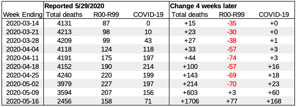
We can see what is happening to the "pending" R99 death numbers over time by looking at the CDC spreadsheets from different weeks. In the graph below, the numbers as shown in the spreadsheet from 5/29/2020 are shown, along with the changes in the most recent spreadsheet that was 4 weeks newer:
The change in total deaths illustrates that reporting for the last 3 included weeks is only about 60-90% complete. The observed changes show that only a few, if any, of the "pending" death certificates were classified as COVID-19, with a possible exception for the most recent weeks. If we look at the week of 4-11, for example, 74 death certificates were removed from "pending", but the number of COVID-19 cases increased only by 3. Clearly, the vast majority of "pending" deaths were classified in a different category, and not as COVID-19.

Based on this analysis, it appears that Texas reports less than half of the excess deaths linked to COVID-19 are caused by COVID-19. In contrast, COVID-19 is listed as cause of deaths for a larger fraction of excess deaths in most other states. However, in almost all states, the officially reported COVID-19 deaths underestimate the additional deaths significantly - typically by about one third.

For the entire US, the officially reported number of COVID-19 deaths on 5/16/2020 was 89,084; the number of excess deaths during the weeks ending 3/14/2020 to 5/16/2020 was 124,219. Due to incomplete death certificate reporting that is only partly compensated for, the actual number of excess deaths is, in all probability, even higher.

Likely causes of low COVID-19 death reporting rates

There are multiple reasons why the reporting rates for COVID-19 are significantly lower than 100%. They fall into several categories:
  • No COVID-19 test results
  • False negative test results
  • Reporting errors
An investigation by USA Today reports that
"many medical examiners and coroners refuse to attribute a death to COVID-19 without a positive test before the person died"
Some medical examiners order COVID-19 tests post mortem, but it is unclear how often this happens. To some extend, such testing can also be subject to political pressure. Even when tests are done, they sometimes can return false-negative results, which makes is less likely that COVID-19 is listed as a cause of death.

For Texas in particular, there are several factors that can cause people to avoid COVID-19 tests. Texas is home to about 1.6 million unauthorized immigrants who may avoid COVID-19 tests out of fear of deportation. Texas also has the highest number of people without health insurance in the nation - 17.7% of the population in 2018, about 5 million people. While federal funds have been made available to test and treat uninsured COVID-19 patients, physician's could register for such funds only after April 27,   according to the Texas Medical Association. Many uninsured Texans may have been hesitant to seek tests and treatment, anyway, because they may be responsible for medical costs, for example if no COVID-19 test is ordered. Even political orientation may contribute to avoiding COVID-19 tests: since President Trump has repeatedly stated that "testing makes the US look bad", and that he has "ordered his people to do less testing", some of his avid fans may regard this as a personal instruction to not get tested. If masks have been politicized and are often seen as a sign of "weakness", why would ardent Trump fans think differently of tests? Combine the politicized attitudes towards a public health issue with sudden worsening that is typical for COVID-19,  and many of deaths caused by COVID-19 never get reported correctly.  Delays in reporting further compound the problem.

Delayed deaths create a false sense of security

At the height of the COVID-19 epidemic in New York, increases in reported COVID-19 cases were quickly followed by increases in deaths:
The delay between the two curves was only about one week.

But the recent increases in cases in the US have shown a different picture - here is a graph for Texas:
Cases have gone up rapidly for about two weeks, but deaths have remained more or less constant. Why?

There are two factors that contribute to the observed differences:
  1. Longer delays between test results and death reports.
  2. The current growth of infections is driven by young people.
The primary reason for a longer delay between test results and reports of deaths is increased testing capacities. In New York, testing was so limited that only people with severe COVID-19 symptoms were tested. This means that tests were not done until 10 or more days after the infection. Furthermore, testing was backlogged, and getting results often took several days to two weeks. So on average, test results became available about 17 days after infection. Deaths from COVID-19 happens, on average, about 24 days after infection, and were reported quickly in New York City. This resulted in the observed 7-day offset.

Since then, testing capacities have increased substantially, and backlogs have been eliminated. People can get tested with mild symptoms, and often even before developing any symptoms. On average, test results now are available within about 7 days after infection - 10 days earlier. In addition, the reporting of COVID-19 deaths in Texas appears to be slower by at least several days. Together, this add about two weeks delay, so that we'd expect deaths to rise about 3 weeks after infections started to rise.

The second difference is that the current wave of infections is driven by young people. COVID-19 is much less deadly for younger people, so they were the first to take advantage of states reopening, often pushing the boundaries. As a result, a much higher percentage of young people is now infected, compared to infections that happened in March and April. This also means that for a given number of infected patients, we will see fewer deaths, so the death curve is expected to rise more slowly.

This, however, is only temporary. 20-somethings may be the first to get infected now, but they will pass the infection to their parents, grand parent, coworkers, and others, so that the age distribution will change and more closely resemble the age distribution of the population. As this happens, the death rate will go up - with an additional delay that reflects the "age normalization" of the infection. When COVID-19 deaths shoot up a few weeks from now, it will not really be a surprise - it's perfectly predictable.

Methods

Data files were downloaded from the CDC "Excess Deaths Associated with COVID-19" web page.
Excess death graphs used the "Predicted (weighted)", "All data" data sets. The latest file version downloaded on 6/24/2020 was used unless otherwise noted (data files are updated weekly by the CDC).

For North Carolina and Connecticut, data for the weeks of 5/9 and 5/16 were incomplete or missing, and adjusted to the values of the "Average expected count" column plus the number of COVID-19 cases reported for the week. The total correction was 3,515 additional deaths (2,321 for North Carolina, 1,194 for Connecticut).

To calculate the total excess deaths, the "observed number" values for the 10 weeks ending 3/14/2020 to 5/16/2020 were added, and the total "average expected count" for these weeks was subtracted (after applying the corrections for Connecticut and North Carolina described above). The total number for the US was determined by adding the respective values for all states.

Reported numbers for COVID-19 cases and deaths used are based on Johns Hopkins data files downloaded from Github. COVID-19 death reporting rates were calculated by dividing the number of total COVID-19 death reported on 5/16/2020 by the number of excess deaths for the 10 weeks ending 3/14/2020 to 5/16/2020.

Monday, June 22, 2020

Why Face Masks Work

While I started advocating the use of face masks and other measures to contain COVID-19 a while ago, I must admit that I was surprised with more recent evidence that face masks work very well to stop new COVID-19 infections.

So I have been thinking about why face masks that may only capture 50% to 80% of virus particles could have such a large effect. One often-heard argument is that fabric and self-made "face masks don't work", because they do not capture very small droplets, and because they often do not fit well, so that a lot of air breathed in or out goes around the mask, rather than through the mask.

But a reflection about what scientists have learned over the last few months provides a good explanation on why face mask can have a huge impact on the COVID-19 pandemic, even if they "capture" only 50% of the virus particles in exhaled droplets.

In recent weeks, it has become increasingly obvious that transmission through airborne virus particles that are emitted when talking, singing, and breathing play a very important role in COVID-19 transmission. Many "superspreader" events where one person infected dozens of others in a short time frame can only be explained through aerosol transmission; choir practice events, where often more than half of the attending singers got infected, are one example.

A game of chance: the "Independent Action Hypothesis"

To understand what is going on, we need to look at the biology underlying COVID-19. When someone breathes in air that contains small, virus-containing droplets suspended in the air, the virus gets deposited on mucous membranes in the nose, throat, and lungs. From then on, it's a race: the virus needs to find a cell that it can infect; infect the cell and multiply; and then be excreted from the cell in large numbers, to find new cells and infect them. Repeating this cycle, the virus eventually is present in the infected body in billions of copies.

But there's many things that can go wrong. At body temperature, the virus is not very stable, and looses its ability to infect after some time. We do not know exactly what this time is, but the data we have is that it's somewhere in the range between a few minutes and perhaps a couple of hours. Furthermore, the human body is not defenseless: it has many different molecules and cells participating in the "innate immune response" that can "kill" the virus (the "kill" is in quotes because a virus does not meet the formal definition of being alive - but it's easy to understand).

So when a single viable virus particle enters the body, there is a chance that this will lead to a full-blown COVID-19 infection - but that chance is probably very small, perhaps 1 in a 1000 (we do not actually know this number, but 1 in 1,000 is a common guess). But as more virus particles enter the body, the chances of establishing a successful infection increase. If it's 10 particles, chances of "success" go up to (about) 10 in 1,000, or 1 in 100; if it's 100 particles, they rise to about 100 in 1,000, or 10%. If 1,000 virus particles enter the body, the chance of success get close to 100% (not exactly 100%, if you'd look at the probability statistics, but close enough for this discussion).

What I described above is called the "Independent Action Hypothesis". We actually do not know for a fact that it applies to COVID-19, but many scientists believe that it applies because it is the most plausible hypothesis.

"Attack rates" within the same household and at "superspreader events"

Next, we need to look at two important questions:
  1. What percentage of people in a household get infected in one person has COVID-19?
  2. Can everybody get infected?
A number of different studies have looked at how likely it is that someone in the same household gets infected if one family member had COVID-19. The actual results vary, but usually falls somewhere in the range between 20% and 60%. In most, if not all, studies, not everybody in the household got infected. Which brings us to the second question: can everybody get infected? Household studies do not give a good answer to this question, because once a person begins to show COVID-19 symptoms, others in the household are likely to be more careful about keeping their distance, washing hands, and so on, to avoid getting infected.

Instead, we can look at "superspreader" events, where a well-defined group was exposed to one or more COVID-19 patients. Cruise ships are one example that caught a lot of attention early in the epidemic, but may lead to false conclusions: as soon as the first likely cases on cruise ships were diagnosed, the passengers typically were isolated in their cabins, which significantly reduced further transmissions.

But there are several other events in the database of COVID-19 clusters, which includes many superspreader events, that provide a better answer. On a French navy ship 61.9% of soldiers ended up with COVID-19 - a total of 1,081 cases. A choir practice in Washington lead to attack rates of 75-80%, and other choir practice events led to similar infection rates. From such events, we have evidence that at least 60% to 80% of people can get infected with COVID-19.

If we put these two bits of information together, we can conclude that exposures to the corona virus often happen at levels where an infection can happen, but only sometimes happen at levels that are so high that just about everyone who can get infected does get infected. For example, if a typical household exposure would consist of 200 virus particles, then we'd expect an infection rate of about 20% - roughly what was reported in some studies.

How even "bad" masks reduce COVID-19 transmissions by 50% to 75%

Let's do a little Gedankenexperiment, where we have three groups of 100 people each that get exposed to COVID-19. In all groups, each person is exposed to an infected person for exactly the time if would take to transmit 200 virus particles.

In group 1, neither the infector nor the infectee wear a face mask, so the infectee receives 200 virus particles. This results in 20 new infections.

In group 2, only the infector wears a mask. The mask is pretty bad and lets 50% of the virus particles through. Therefore, each infectee receives 100 virus particles. This results in 10 new infections - a 50% reduction.

In group 3, both the infector and the infectee wear a "50% reduction" mask. Each infectee receives 50 virus particles, resulting in a total of 5 new infections. The overall reduction of new COVID-19 cases is 75%.

The numbers above are just intended as examples. The scenario is also simplified; reality would typically include different exposure levels for different people, and other variables. But even with further refinements, it is plausible that a large number of COVID-19 infections happen at levels where the likelihood of infection is directly proportional to the number of virus particles a person is exposed to, and that reducing the number of virus particles by using "bad" face masks can still have a large effect.

In the context of an epidemic, what is basically a linear effect on an individual level can be a much larger effect on the growth rate of the epidemic. For example, if the effective growth rate R is 2.0 without mask, but mask use reduces transmissions by 50%, that would convert the growth from exponential to stationary with R = 1.0. A reduction by 75%, as in the "group3" example above, would lead to R=0.5, and a rapidly shrinking number of new transmissions.

But ...

isn't that too simple? Indeed, I made a number of simplifications above. Also, the analysis often relies on assumptions where we do not have actual data. But the assumptions I made are more reasonable than most, if not all, alternative assumptions (for example a "threshold level" hypothesis instead of the "Independent Action" hypothesis). However, the general conclusion that many transmission happen in the "linear dose-response range" matches many observations made in recent months about COVID-19 transmissions, and what we have learned about the underlying mechanics. If you'd like a more formal analysis, check out the publication titled "To mask or not to mask: Modeling the potential for face mask use by the general public to curtail the COVID-19 pandemic" that came to very similar conclusions.
--
Note added 6/29/2020:
In the week since I wrote this post, several new studies describe empirical evidence that face masks are effective to reduce COVID-19 transmissions.

One study, titled "Data-driven estimation of change points reveal correlation between face mask use and accelerated curtailing of the COVID-19 epidemic in Italy", showed that the number of new COVID-19 infections declined faster after masks became mandatory, and concluded that "widespread use of face masks and other protective means has contributed substantially to keeping the number of new Italian COVID-19 cases under control in spite of society turning towards a new normality".

A second study titled "Face Masks Considerably Reduce Covid-19 Cases in Germany" looked at different regions in Germany, where face mask use became mandatory at different dates. It concluded "face masks reduce the daily growth rate of reported infections by around 40%".

Faced with a mounting body of scientific evidence that face masks work, and very rapid growth of new COVID-19 infections in many southern states, even "leading Republicans are publicly embracing expert-recommended face masks as a means to slowing the spread of the deadly coronavirus", according to an NPR article, leaving President Trump and Vice President Pence increasingly isolated in their opposition against wearing face masks.

Wednesday, June 17, 2020

Multi-state Evidence That Facemasks Stop COVID-19

The number of new COVID-19 cases in the US has been relatively stable overall, but huge differences between states exist: some are showing continuing declines, while others are reporting rapid increases in case numbers. This graph illustrates the dichotomy:
For the last three weeks, Alabama, Arizona, Arkansas, and California have shown increases in new COVID-19 cases, while Colorado, Connecticut, Delaware, and DC have shown decreases. Only a small fraction of the increases in most states can be explained by increased testing, as I explained in a previous post. Changes in testing do not explain the observed differences to states with decreasing case numbers at all, since testing has increased even in the states with lower reported case numbers.

So - how can we explain that many states show increases in COVID-19 transmissions, while many other states show decreases? One possible explanation are differences in when and how states "re-opened" by removing stay-at-home orders and social distancing restrictions. But while this may indeed explain some of the differences, it is unlikely to be the determining factor, given that most states have started re-opening several weeks ago, and that some states like California where many restrictions remain in place in large population centers nevertheless show increases. But a recent article in the journal "Health Affairs" provides another possible explanation: that differences in new COVID-19 cases are caused by differences in face mask wearing. So I decided to look into this.

According to the article, 15 states and the District of Columbia have issued mandates for face mask use in public, and the list of these states is given in the supplementary materials.  As an indicator of recent changes in COVID-19 cases, I used 15-day trend lines from my "data trend model", which are based on 7-day averages new case numbers from Johns Hopkins data. The slopes of the (log-based) trend lines give a good indication of where case numbers are going, with positive slopes indicating increases and negative numbers indicating decreases. I excluded the two states that had fewer than 10 new cases in the most recent 7-day averages, Montana and Hawaii. The data for the 15 states with the highest and lowest slopes are shown in the next graph:
The 15 states at the top of the graph (Michigan - DC) have decreasing COVID-19 case numbers. 11 of the 15 states have face mask mandates. The 15 states at the bottom of the graph (Utah - Oregon) have shown increasing COVID-19 case numbers in the last 2 weeks; only one of the 15 states, Utah, was listed in the article to have a face mask mandate. However, the actual wording of the executive order issued on 4/10/2020 uses the word "directives", not "mandate" or "order", and does not mention any enforcement provisions or penalties. In an updated order from 5/27, the "directive" is explicitly changed to an "order", but only for certain business employees and health care settings; for the general public, only a "strong recommendation" to use face masks is issued.

Of the states shown as not requiring face mask orders in the declining groups, both Colorado and New Hampshire have issued strong recommendations to use face masks in public. Virginia's governor issued an executive order that requires face masks for "patrons" in most businesses, including retail and restaurants, and in public transportation.

The attitude towards face masks for states in the lower half of the graph, which report increasing COVID-19 cases, tends to be different. For example, the governor of Texas has issued an executive order that "bans local governments from imposing fines or criminal penalties on people who don't wear masks in public".

Even when orders or recommendations to use face masks exist, how many people follow the recommendations can vary significantly. Multiple surveys have shown that Democrats are much more likely to wear masks that Republicans, with reported mask wearing percentages of 75% vs. 53% according to one survey of 2,400 Americans, and 92% for Democrats versus 53% for Republicans in Minnesota according to another survey.  Of the 15 states with declining daily new COVID-19 cases shown in the graph above, only 3 (20%) were won by Donald Trump in the 2016 election; of the 15 states with increasing case numbers, 12 (80%) were won by Trump. Since Trump has steadfastly refused to wear face masks in public, many of his fans also refuse to wear masks.

The research study I mentioned above is just one of many studies that confirm that face masks are effective at reducing COVID-19 transmissions. Another study that used computer simulations showed that face mask can reduce COVID-19 infections and deaths significantly even if just a subset of the population wears face masks, with such reductions being higher if a higher percentage of the population wears masks. A meta-analysis that looked at data from 172 observational studies with a total of 26,697 patients concluded that "face mask use could result in a large reduction in risk of infection", with an reported "adjusted odds ratio" of 0.15.

Many researched had long suspected that face masks can be an important tool for containing COVID-19. This was based on the comparison of Asian countries where face mask use is common, and COVID-19 was quickly contained, to European countries where face mask use was initially strongly discouraged, and the COVID-19 epidemics reached much higher levels. Given what we have learned recently, it appears that face masks, when combined with basic social distancing, are even more effective than even optimists thought. One indicator of how well face masks work can be found in the statistics for European countries like Austria and Germany that have re-opened their economies without seeing an increase in new COVID-19 cases. A common factor in these countries if that face mask use in public is mandatory if social distancing cannot be maintained.

Ironically, the widespread use of face masks seems to be a critical element that allows re-opening the economy while keeping COVID-19 under control - but the president of the US, who has clearly stated that re-opening is his absolute priority, has consistently refused to use face masks.

Monday, June 15, 2020

Does More Testing Explain The Rise In COVID-19 Cases?

The number of new daily COVID-19 cases in the US has been rising for the last few days, and several states have set new records. Is the rise in case numbers mostly due to more testing, as several governors in states with rising numbers have claimed? Or do the rising numbers indicate a "true" increase in transmissions due to state re-openings?

Here is a look at the recent trends for several states that have shown increases in COVID-19 cases since the beginning of May, using Johns Hopkins data:
For comparison, here is a graph of states that have seen a consistent drop in COVID-19 cases:
Note that the second graph uses a logarithmic scale, since some of the drops are quite large. The drops in cases are relatively constant on the log scale, whereas the growth in cases shown in the first graph is restricted to the last 2-3 weeks for most states. Let's have a look at a couple of states in detail, comparing the number of tests to the number of COVID-19 cases (data are from the COVID tracking project). First, Arizona:

Data are smoothed using 7-day trailing averages to remove most of the day-to-day variation. For Arizona, we can see that both test numbers and positive cases increased in the period shown. However, the number of tests (in red) increased only by about 50%, while the number of COVID-19 cases increased by about 300%. So while the increase in testing contributed to the increase in confirmed cases, the primary cause of the observed increase in cases was an increase in transmissions; increased testing alone would only have resulting in a rise of daily cases to about 200, not to more than 400.

Next, Florida:
The number of daily new COVID-19 cases in Florida more than doubled over the last 2 weeks. While there also was a small increase in testing between 6/3 and 6/10, the steepest increase in cases happened after 6/10, when the number of tests dropped. Furthermore, the number of tests per day remained lower than it had been around 5/25. Clearly, the simple equation "more tests = more cases" does not explain the observed trend in Florida.

For comparison, let's have a look at New York:
For New York, the number of tests per day almost doubled to more than 60,000 between 5/20 and 6/14, but the number of confirmed COVID-19 cases dropped from about 2,000 to about 800. Clearly, the effect of continued social distancing and similar government restrictions by far outweighed any  increase from more testing.

The results for many other states are similar: numbers decreased in many northeastern and central states despite more testing, while the increases in many southern and western states were much higher than what can be explained by increased testing.

One factor that comes into play here is that increased test availability changes who can get a test. When tests are in short supply, stringent criteria are used to limit testing to those most likely to be positive; typical restrictions include the presence of symptoms and contact with a confirmed case. During the height of the COVID-19 epidemic in New York City, the positive rates exceeded 50%, and fewer than 10% of infected persons were tested. As tests become more widely available, restrictions who can get tested are relaxed, and the positive rate drops. When convenient, cost-free tests that do not require doctor's referrals or the presence of symptoms are available, some people get a test "just to be safe", or because they had unspecific symptoms so long ago that the chance for a positive test are very small. As a result, a sudden doubling in test numbers does typically not lead to a doubling in confirmed cases, but rather to a significantly smaller increase - which is exactly what we are seeing.

Looking at the graph of daily cases in the US on Worldometers,  very little seems to have changed since the beginning of May - aside from small fluctuations, mostly within each week, the number of daily cases now seems very similar to the number a month ago. What the graph does not show, however, are fundamental differences between the states, with many states showing consistent decreases while others show rapid increases. If we look at the states shown in the first two graphs, but omit the two most heavily hit states, New York and New Jersey, then the drop in one group is pretty much canceled out by the rise in the other group:

What we are seeing now is that the case numbers in the states that used to have by far the highest numbers are so low that further decreases do not change the overall total much; at the same time, the numbers for the "second riser" states like Arizona and Florida have reached levels that do make a difference. Worse, the growth in these states appears to be accelerating, with observed doubling times of two weeks or less. While this growth is not as rapid as during the early growth phase in March, it is fast enough to lead to significant underestimates of the severity of the epidemic.

The states that show rapid COVID-19 have several things in common, which include earlier re-opening and higher average temperatures, compared to the states that show declining case numbers. As described in this article, this dashes the hopes that the virus will "disappear" due to higher temperatures; instead, the higher temperatures cause people to spend more time indoors, where the risk of transmission is higher than outdoors. Right now, states like Arizona show only one fourth the number of COVID-19 cases per million population that New York or New Jersey have, and the actual factor may be even larger since testing was in short supply during the height of the epidemic in the Northeast. But with observed doubling times of two weeks and governors who clearly indicated that they will not re-institute restrictions before hospitals overflow, these states may "catch up" before the summer is over.

Friday, June 5, 2020

Painting a Rosy Picture: Why Many COVID-19 Tests Fail

Some widely used COVID-19 tests can have very low sensitivity, missing half or more of infections. That's the conclusion from a new study published yesterday from researchers at Harvard and the Beth Israel Deaconess Medical Center in Boston, combined with information that companies have submitted to the FDA about their tests. Unfortunately, one of the least sensitive tests has become very popular in many states.

Let's start with a graph from the study:
Very sensitive tests, like the Abbott PCR M2000 test, will give positive results if the viral load is at least 100 genome copies per milliliter, and therefore detect about 85% of all infections. The other tests in the graph are less sensitive, and therefore detect fewer infections. In other words, they have a higher false-negative rate.

The curve above is based on the analysis of quantitative PCR test results for 4,774 patients with a positive COVID-19 test, which showed a very wide variation in viral loads:

Some patients had as few as 10 copies of the viral genome per ml, while others had 1 billion copies per ml. Between about 100 copies per ml and 100 million copies per ml, the distribution is quite even - the number of people in each category is about the same. This distribution is what creates the solid black line in the first graph.

There are many reasons why the number of virus particles can vary so drastically. One is the timing of the test: the viral load increases from initial infection to the onset of symptoms, and then usually starts to decrease. Researchers from countries with extensive contact tracing and sufficient testing capacities have published many studies that show tests that were initially negative, turned positive after a few days, and later reverted back to negative. Additional variations can come from how exactly the swab is done; where in the body the virus replicates most successfully; the number of virus particles that caused the initial infection; and differences in the innate and adaptive immune response between individuals. Individuals with the highest viral loads may be more likely to be "superspreaders" that can infect dozens of others, but even many of those with low viral loads are likely to contagious.

For the sensitivity figure above, the authors simply used the documentation that had been submitted to the FDA by the different companies. They point out that the description of the "limit of detection" is not standardized - some companies use the number of genomes per milliliter, others use TCID50, and so on. Neither is there a single way to determine the detection limit. Some companies start with swabs that they add a known amount of viral RNA to, and then go through the entire detection protocol, mimicking "real world" situations as closely as possible. But others add the known RNA sample much later in the process, after isolating the viral RNA. To really compare the claimed sensitivities, it is necessary to inspect the protocols closely.

TestUtah, TestNebraska, TestIowa, and Co-Diagnostics

In my previous post, I had talked about a Utah company that has won big testing contracts in Utah, Iowa, and Nebraska, where is has been criticized for what appears to be an extremely low rate of positive test results. The company uses tests from another Utah company, Co-Diagnostics, which stated in March that it can produce 50,000 COVID-19 tests per day. A month later, Co-Diagnostics announced a collaboration with the life sciences company Promega to produce more test kits.
In the documents submitted to the FDA, Co-Diagnostics claims a limit of detection of 4,290 copies per ml. Using the sensitivity curve above, this would result in a detection rate of about 60% - but a closer inspection of the document indicates that this is overly optimistic.

Co-Diagnostic describes that it used sputum samples for the sensitivity experiment. That is highly unusual, since sputum samples are rarely tested in the US, where nose or throat swabs are typically used. The genomic RNA used was added to only after the RNA purification step, directly before the PCR reaction. This avoided potential losses in the elution step, and potential degradation, which could have reduced the reported sensitivity further. But the bigger difference is elsewhere: when swabs are used, they are typically put into a test tube with 2-3 ml of saline or viral storage medium. The purification column used for the Co-Diagnostic kit, however, is designed for a volume of only 140 microliters. This effectively adds a 14- to 20-fold dilution step. For swab samples stored in the standard 2 ml of medium, therefore, the detection limit would be about 61,000 copies of viral RNA. According to the sensitivity graph above, this drops the detection rate to 50%. With accounting for losses during transport, storage, and RNA isolation, a false-negative rate of more than 50% is likely - which is exactly what was observed in Utah.

Abbott's ID NOW and "User Error"

Another test that has been shown to have a high percentage of false negative results is Abbott's ID Now COVID-19 test. One study showed false negative rates up to 45% when using diluted RNA samples. Abbott was quick to go on a counter-offensive and blame "user error" for high reported false negative rates, a statement that was repeated by Health Secretary Alex Azar. However, Abbott's own data showed false negative rates between 8.7% and 16.7% when compared to sensitive PCR assays, and concluded that higher false negative rates are linked to lower viral loads. The results are similar to two independent studies which found false negative rates of 12.3% and 26.1%, while more accurate PCR tests had false-negative rates between 1% and 5%. All studies agree that the Abbott test is less accurate at low viral loads; the highest sensitivities were seen in settings where viral loads were likely to be highest: in symptomatic patients relatively shortly after onset of symptoms.

Both the Co-Diagnostic and the Abbott tests show high false negative rates at low viral loads, which means they are not suited for "open" testing (like state-wide drive through testing without requiring COVID-19  symptoms) or testing done as part of contact tracking, since infected persons that do not (yet) show symptoms have lower viral loads, and are therefore much more likely to give false negative results.

Lessons from China and New York

Looking at the documentation test companies provided to the FDA, it is normal to see claims of 99-100% detection rates. In view of variations in viral load and even results from company-sponsored studies, such numbers are extremely unrealistic. A number of scientific studies from Asian countries report actual PCR detection rates around 60-80%. In China, symptomatic patients were routinely tested by PCR and chest CT scans, and positive chest CT scans were viewed as sufficient to diagnose COVID-19 even if the PCR results were negative.

New York City also provides clues about false-negative test results. During the height of the epidemic in NYC, COVID-19 testing capacity was insufficient, and testing was largely restricted to symptomatic patients admitted to hospitals. At the same time, overloaded hospitals meant that only patients with very severe symptoms were admitted; news papers reported that ambulances refused to transport patients to hospitals unless their blood oxygen levels were dangerously low. Nevertheless, the positive test rate in New York City never got much higher than 50-60%. Even the deaths numbers for NYC reflect that many who died from COVID-19 in NYC either did not get tested, or had negative test results: about 22% percent of COVID-19 deaths (4,727 of 21,782) did not have a positive PCR result. In all likelihood, this number is too low: death certificate analysis for NYC shows 24,480 excess deaths in NYC between 3/15/2020 and 5/23/2020 compared to last year. This  puts the actual rate of COVID-19 related deaths in NYC without a positive PCR result at 30%. Unfortunately, information about which exact tests are used are not published, but the timing of deaths in NYC means that most tests must have been done with tests that have higher sensitivity than the Abbott and Co-Diagnostics tests.


Thursday, June 4, 2020

COVID-19 Variability In US States

Here's a look at confirmed COVID-19 cases and deaths in the US, using 7-day average to smooth out day-to-day variations:
For comparison, here is the graph for Germany:
There is a remarkable difference in the offset between the case and death curves. In Germany, deaths rise and fall with about a 2-week delay, which is close to the about 19 days between symptom onset and death. In the US, the delay is only about one week, mostly due to longer wait times for tests and test results.

But the bigger differences are in how far the curves dropped after the peak in deaths around April 18. In Germany, the number of daily COVID-19 cases dropped by a factor of about 15, and the number of daily deaths by a factor of 10. In the US, cases dropped only by about one third, while the number of deaths dropped by a factor of 2.3.

In general, the number of deaths and cases should fall by the same factor, but that's not what we are seeing. The relatively lower drop factor in cases in Germany is due to the delay between diagnosis and death; if we look at the case numbers 2 weeks ago, the "case drop factor" is also about 10. In contrast, the US shows a larger drop for deaths than for cases. This is partly due to insufficient test capacity during the peak of the epidemic. In many regions, but especially in New York and New Jersey, test capacity was so severely limited at the beginning of April that some hospital patients could not get tested, and wait times for test results sometimes exceeded a week or two. In addition, the ongoing ramp up of testing in late April and May also led to an increase in reported cases.

But when looking at the COVID-19 numbers for the US, we have to keep in mind that there were dramatic differences between states in case numbers and government interventions, which is reflected in the graphs for different states. The states that were hit hardest responded with the most stringent stay-at-home orders and other measures to contain COVID-19, which drove new infections and deaths down - here is New York as an example:
Daily deaths dropped by a factor of about 10, similar to the what we saw for Germany. But other states saw only relatively small drops, followed by relatively steady numbers for both cases and deaths. Georgia is a typical example:
While most states issued "stay-at-home" orders, there were large differences between how strict orders were; whether or not they were enforced; and how long they remained in place. While most states ordered "non-essential" businesses to close, they had very different definitions on what exactly constitutes an "essential" business. Whereas New York closed down just about everything except groceries and hospitals, some states considered all construction-related business as essential and allowed them to continue to operate. Similar differences existed in closing public spaces like parks and beaches. Perhaps even more importantly, significant variation existed in adhering to local restrictions, and to suggestions or mandates to wear face masks.

A number of states with more "business-friendly" restrictions showed a relatively constant increase in new cases. One example is North Carolina:
The relatively steady number of deaths between April 20 and May 16 indicates that some of the steady increase in cases is due to increased testing. However, the number of daily COVID-19 deaths only dropped briefly, and has since risen to new records; at the same time, the number of confirmed cases shows a steep upwards trend, indicating that the number of deaths will continue to grow in the next weeks.

Another interesting case in Utah:
The daily confirmed cases show a slight upward trend from the middle of April to the middle of May, which is also seen in the daily deaths. For the last week, however, the number of cases is rising rapidly, while deaths seem to be on a downward trend. But a closer look at the CDC death certificate data and the analysis of "mystery deaths" indicates that Utah appears to be cheating:

Since April 11, Utah has an increasing number of deaths that are in the "not elsewhere classified" category - "mystery deaths". Typically, Utah should have about 4-5 deaths per week in this category, corresponding to the historical average of 1.25% (the CDC spreadsheet masks all numbers between 1 and 9, so we don't know the exact counts for many weeks - but it will be close to 5). But the number on deaths in the "mystery" category has increased at the same time as COVID-19 cases, and actually to higher levels than the number of "official" COVID-19 deaths. For the week of 5/16, about 10% of all deaths in Utah were "mystery deaths". Considering that reporting of death certificates for recent weeks is typically incomplete, and looking at last years numbers, it appears that COVID-19 is currently increasing the death rate in Utah by 10%. But most of these deaths have been "moved" to the "mystery death" category, and do not get reported as COVID-19 deaths.

There is one plausible explanation for COVID-19 deaths being classified in the "mystery death" category: false negative test results. For properly performed PCR tests, the false negative rate should generally be less than 5%, but it can reach almost 50% for tests done on using Abbott's machine (for which the company blames "user error"). Even that would not explain the ratios we are seeing for Utah, though. However, one company that performs test in Utah, called "TestUtah.com", has been criticized for a what looks like an extremely high percentage of test failures: while other labs in Utah report positive rates of 5%, TestUtah reports rates of only 2%. TestUtah has declined to join other state labs in a test to confirm accuracy.  The same company has also received a no-bid contract in Nebraska under the name "TestNebraska", where it reported a 3% test positive rate, 6-fold lower than the 8% positive rate other labs reported. The company also failed to meet the contractual 48-hour turnaround time and test numbers; all this prompted state lawmakers to call for a termination of the contract in Nebraska. Similar problems have been reported from Iowa, where the company operates under the "TestIowa" name.

On the other hand, companies like TestUtah / TestNebraska / TestIowa may be quite welcome by governors and politicians that regard "re-opening" as more important than preventing COVID-19 transmissions and deaths. The Utah government has declared that "Utah’s social distancing efforts to slow the spread of COVID-19 have been working", and declared most of the state as "low risk" areas where all businesses are allowed to operate, with only 3 counties remaining in the "moderate risk" category, and no county in the "high risk" category. Between inaccurate COVID-19 tests and mis-diagnosed COVID-19 tests, it seems Utah is doing what it can to make COVID-19 "just disappear".  Unfortunately, other states appear to follow a similar approach, as I described in my last post.