Thursday, April 30, 2020

The Cost of Making COVID-19 Disappear

President Trump keeps stating that COVID-19 "will just disappear", "just go away", that "it will be gone". I understand that many scientists and democrats are skeptical about these statements - but how about we instead explore where they may be coming from? In this post, I will look at one of two possible explanations: an exceptional willingness to sacrifice.

Let's start with a look at the current situation - how many new COVID-19 cases per day we see in the US:
The data are a bit up and down, but if we look at the red line which shows 7-day averages, we can see a small downward trend in the last 2-3 weeks. What would happen if this trend continues? You could have a look at my "Data Trend Model", but for this post, I'll go back to my older epidemiological model instead. The trend in the last 2 weeks correspond to a reproduction number just below now; with the parameters used in the model, it comes out to an R(0) of about 0.98. Here's what the daily cases would look like for the end of the year:
There would be a steady but slow decline, and the numbers would not quite be at zero by the end of the year. Here is what the cumulative numbers would look like:
By the end of the year, we'd have about 245,000 COVID-19 deaths in the US. But getting there would require to keep the current "stay at home" measures and business closures in place the entire time, which is clearly not going to happen.

Instead, we are starting to see beaches and business re-openings in multiple states. Without any doubt, this will increase COVID-19 transmissions. However, since many people will practice "social distancing", wear face masks, and so on, the epidemic will grow slower than in the initial phase, where the reproduction number R was about 4.0. So let's look at what happens if we get a transmission increase that corresponds to an R(0) of 1.2:

The number of daily cases will grow until it reaches about 60,000 cases per day, roughly twice what we have right now. The number of daily death will also be about twice of what it currently is. One interesting feature of the prediction is that numbers start to go down again in August, even without any new restrictions. To understand this, let's have a look at the totals:

In August, we reach about 6 million confirmed cases. The model assumes that only one out of ten infections is actually tested and reported as positive, which is in line with estimates that used various different techniques. So the total number of infections in August is about 60 million. That's close to 20% of the US population. We also assume that most people who have been infected cannot get infected again; that may not be proven yet, but it is very likely, at least over the time that we are looking at. Now an R of 1.2 means that every person will infect on average 1.2 other people. To avoid "partial people", let's look at 100 infected persons - they would infect 120 others. But if 20% of them have been infected before, only 80% of the 120 would "catch" the infection: just 96 people. That means the number of infected people will slowly go down.

However, this comes at a cost: instead of 245,000 deaths from COVID-19, we now have 710,000 deaths - almost half a million of additional death.

There is absolutely no doubt that "re-opening the economy" will cause an increase in COVID-19 cases, but we do not know by how much. It is quite possible that the reproduction factor will go up to 1.4 instead of 1.2; that's still a lot less than a couple of months ago. So let's look at how many cases and deaths we would see:

With the faster growth, we'll reach the peak in new daily cases at the end of July. Both daily new cases and daily deaths would be about six times higher that what we currently see. But at the end of the year, the number of daily COVID-19 cases would be very close to zero. Here are the total numbers for this scenario:
The total number of "confirmed cases" would be above 16 million; since we assume a 10:1 ratio of infections to positive tests, that means about half of the US population would have caught the corona virus. The model assumes that 0.6% of all infected persons die from COVID-19, which gives about 1.17 million deaths. Compared to the original scenario, that is more than 900,000 additional COVID-19 deaths.  But since the model does not take increased death rates from overcrowded hospitals into account, this number is likely to be too low, and the actual number of additional deaths is likely to exceed one million.

For many, the thought of a million additional and avoidable death from COVID-19 is terrifying. However, others will point out that this is "only" 0.3% of the US population, and that the chance to die of COVID-19 is much lower than 0.3% for anyone who is younger than 50 years and healthy. Many of the protestors who demanded a lifting of stay-at-home orders in the US stated that they would be happy to accept the risks. At least one person has carried a sign demanding to "sacrifice the weak", but many protesters have carried signs indicating that they regarded their "rights" as more important that preventing COVID-19 infections and deaths. President Trump has repeatedly encourage these protests, and indicated that he regards the performance of the economy as the most important measure. Therefore, we must conclude that he does indeed have an exceptional willingness to sacrifice - to sacrifice a million lives so that "the economy" can be "re-opened" faster.


Monday, April 27, 2020

COVID-19 Testing and "Reopening": A Reality Check

How much testing do we need to "re-open" the economy? Let's look at a comparison between countries to get an idea. But how do we take into account that countries are very different in size, and have very different numbers of COVID-19 cases? One way would be to simply divide tests by the number of confirmed cases. But there's a problem with this approach: some countries are known to not test everyone with COVID-19 symptoms, so their official "confirmed case" numbers understate the magnitude of the epidemic - sometimes by very large factors.

A better number to use for normalization is the number of COVID-19 deaths. There are also some differences between countries about what they count as a COVID-19 death, but they are not nearly as large as the differences in who gets tests. So here's a look at some countries:
The green bars at the top are for countries that have managed to keep COVID-19 under control, with Taiwan leading the pack. Each of these countries has done more than 2,000 tests per COVID-19 death (for the numbers shown, I used the reported test numbers from 10 days earlier, since there is a delay of about 10 days between test results and death).

The middle group with blue bars has done a few hundred tests per COVID-19 deaths. All three countries show a clear downward trend in new cases (more about that below).

The last group has states with fewer than 100 tests per COVID-19 death, and includes the US, Italy, and the United Kingdom. This group also has the highest number of COVID-19 deaths, relative to population size.

Overall, the relative number of tests is strongly correlated with how well a country managed to control the COVID-19 epidemic - but why? Simply put, more testing allows countries to find a higher percentage of those infected with the virus, so that they can be isolated, which prevents further transmissions. More testing generally goes hand-in-hand with earlier testing: if plenty of test capacity is available, everyone can get tested right away. For the countries in the green group, this includes not only anyone with symptoms, but also anyone who has been in contact with a confirmed case. These countries all have large and efficient "tracking" efforts to find such contacts, and test them before they can infect anyone else. This is very important for COVID-19, since many transmissions happen before the first symptoms appear, or are from persons who never develop significant symptoms - but can still infect.

The goal for test and track is clear: test every person who is infected as soon as possible, and if a test is positive, test every person that has been in close contact with him or her. How does that relate to deaths? Various studies have shown that about 0.5% to 1% of all people infected with the SARS-CoV-2 virus die. Therefore, we absolutely need to test about 100 to 200 people for every reported death. To also test everyone who has been in close contact with an infected person, we need to test maybe another 5-10 people per infected person. That brings us to about 500 to 2000 tests per COVID-19 death.

We know that the tests can sometimes be negative when they are done to soon after infection, so ideally, everyone who tests negative should be tested again a couple of days later. Similarly, anyone who tested positive should be tested at least a couple of times with negative results before he can be released from quarantine. This adds another factor of at least two, so now we are at a absolute minimum of 1,000 tests per death that need to be done, with a range up to 8,000 tests per deaths. That's exactly what we are seeing for Taiwan, Australia, Singapore, New Zealand, and South Korea.

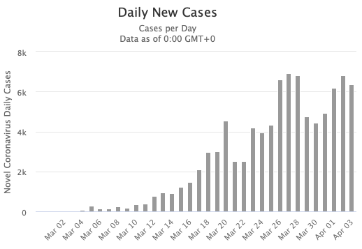
For countries that have seen a larger case and death load than these countries, it is imperative to first reduce the number of active COVID-19 infections. Let's have a look at how some of the countries on our list have done. Let's have a look at Germany's daily cases, using a graph from the Worldometers web site:

There's definitely a downward trend, but the day-to-day variations make it difficult to quantify. So we need to smooth the data first, for example by using 7-day averages. We expect new cases to be proportional to current cases, which means we would have an exponential function; so we can take a log of the smoothed numbers, and try to fit a straight line through them - say, for sliding one or two 2-week periods. The slope of the line then corresponds to the growth rate of the epidemic - it tells us how fast the case numbers are going up or down. Here's a look at this curve for Germany:
The black line shows the growth rate for cases, the blue line for deaths. Due to averaging and using 14-day ranges to calculate the growth, the curve are a bit delayed to the raw data. But we can see that the growth of the epidemic in Germany was fastest before the end of March, and that the case numbers have been decreasing for a few weeks now: the black curve is in the green zone that indicates a negative growth rate. The decrease is significantly slower than the initial increase, though.
Here's the graph for Australia:
Australia has done better than Germany. It managed to keep the epidemic on a much smaller scale (relative to population), and the decline in cases was almost as fast as the incline.  Now let's look at the US:
The US barely managed to stop the growth of the epidemic; daily case numbers are roughly stable, when compared over a 15-day window. However, things differ a lot by state. Here's New York:
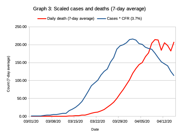
The strict stay-at-home orders in New York have managed to control the epidemic, and case numbers as well as daily deaths are shrinking. However, raw CFR (deaths divided by cases) of 7.7% is much higher than Australia's 1.2%, indicating that just a small subset of infections was tested.

Now let's look at a couple of states that have announced that they want to "re-open" the economy by gradually relaxing stay-at-home orders.
 Michigan managed to have a negative growth rate, but the CFR is even higher than for New York, meaning that way too little testing has been done in Michigan. The official case rate is almost 4 per 1000 inhabitants, but the actual rate is likely to be at least tenfold higher.

Illinois is also eager to re-open the economy. However, both death and case growth rates have remained positive, meaning that the number of cases per day is still growing, even before restrictions are relaxed.
Alaska has a case rate that is about 8-fold lower than the rate for IL and MI, and a low CFR rate that indicates more testing. The case growth shows an accelerating downward trend. Of all states looked at so far, Alaska is in best shape for re-opening, although more testing will be needed to make test and track effective.
Colorado shows an upward trend in both case growth and death growth, and a high CFR above 5% that indicates insufficient testing.
Minnesota appears to have a relatively low case rate, but the high CFR of 7.6% indicates that this is most likely due to insufficient testing. Both cases and deaths have shown a positive growth rate the entire time - things are continuously getting worse in Minnesota. Like most of the other states shown above, Minnesota is in absolutely no shape to re-open the economy; quite the opposite - business restrictions and social distancing requirements need to be stricter than so far so that the growth in new transmissions can be stopped.

In conclusion, the observed trends in new case growth show that a containment of the COVID-19 epidemic has not been achieved at anywhere close to sufficient levels in most of the states that plan to re-open the economy soon. Relaxing social distancing restrictions will cause COVID-19 infections to accelerate in these states. However, the increases will only be picked up with a substantial delay; it will probably at least 10 days to 2 weeks before even a slight increase becomes noticeable above the day-to-day variations. It is very likely that the number of COVID-19 infections in each of these states will rise to a multiple of the current number before the governors in the affected states will even start to consider re-enacting restrictions that have been removed to early.

Friday, April 24, 2020

Data Trend Model: Details

This post gives some details about the "Data Trend Model" I use for COVID-19 projections, so it's a bit technical. For a more casual description, please read this post.

Model Goals

The goal of the model is to answer the question "What will happen in the US if the current trends continue?".  It tries to do this with a minimum amount of assumptions. Data trends are calculated separately for each US state (or region etc. for places like Puerto Rico and Guam), and added together to get projections for the entire US.

Challenges

Day-to-day variances in reporting: The daily reports of new confirmed COVID-19 cases and deaths shows a lot of variability; on occasion, daily numbers for some counties or even states are completely missing, and then presumably included in the next day's report.

Weekly cycles: Data for multiple states show strong weekly patterns, for example significantly lower case numbers on weekends, and higher numbers during the middle of the week.

"Special events": Reported numbers often show short dramatic increases that can be linked to specific causes. One example was a spike in the cases reported by Ohio when prisoners in the state were tested, and a very large fraction tested positive for COVID-19.

Approach

Data source: Daily case numbers are downloaded from the Johns Hopkins data page on GitHub.  County data for each state are summed up, and daily new cases are calculated from totals.

Data smoothing: To reduce the impact of day-to-day variations, daily new cases are smoothed with a 3-day block average (2-day average for the last day). In the future, I will re-evaluate using a 7-day average that would also remove most errors from weekly cycles; however, the longer smoothing will reduce the sensitivity of the model to recent changes.

Trend lines: To extrapolate future changes, trend lines (linear regressions) are computed from the log of the smoothed data. Log numbers are used because new infections during steady phases of the epidemic are proportional to the number of active infections, which will give exponential increases or decreases that result in straight lines in the log graphs. To avoid distortions from weekly cycles, primary trend lines are calculated for 7 day periods and 15-day periods.

Limits to growth rates: Several steps are taken to prevent over-estimates of growth rates to cause "runaway states" to dominate the statistics. When 7-day trend lines show an increase in cases (a positive slope), the 15-day trend line is also considered, and the 15-day slope is used if it is lower. This reduces or eliminates some of the artifacts from "special events".
When estimating future case counts, the growth of daily case numbers in each state is limited to 14 days. After 14 days, the number of daily cases in the state remains constant. This reflects the expectation that governors will eventually impose stricter measures when reported cases increase consistently. It also reduces the effects of over-estimates from "special event" artifacts.

Estimating deaths: Daily deaths are estimated using time-shifted case numbers (-9 days) and the observed  time-corrected case fatality rate (7.14%).

Limitations

Steady state assumption: The model assumes that the transmission rates remain constant going back about 7 days and going forward. It does not predict the impact of future changes like relaxing or imposing new social distancing rules. However, the effect of such changes will eventually become visible through changes in the predictions.

Sensitivity to noise: Predicted trend lines are sensitive to random day-by-day variation, especially for the last day's data. This is reduced, but not eliminated, by data smoothing and the use of 7-day trend lines.

Test rate differences: Projections are based on assuming uniform test rates between states. This assumption in very unlikely to be correct, but accurate per-state information about what percentage of actual infections in each state is reported in the "confirmed cases" number is not available.

Hospital overloading: The model does not take the potential effects of limited hospital and intensive care capacity into account, which may increase fatality rates.

Under-reported deaths: It is likely that the reported number of COVID-19 deaths underestimates the actual number of deaths caused directly or indirectly by COVID-19, for example because death certificates for people who died without a prior COVID-19 test often do not show COVID-19 as a factor in the death. The model does not try to adjust for such under-reporting, and therefore is likely to under-estimate the number of COVID-19 related deaths.

Tuesday, April 21, 2020

Better COVID-19 predictions

Any model for COVID-19 cases should be based on actual data. Any extrapolation towards the future has to reflect what we know about current case trends, the coronavirus, and epidemiology.

I have developed such a model which I call the "Data Trend COVID-19 Model". Let's start with some results before I explain the model. Here is a projection of total "confirmed cases" and deaths in the US for the next two months:
The numbers shown are based on state-by-state projections, using the basic assumption that future decreases and increases in case numbers will stay on the same course as during the last week or two. That's easiest to see if we look at state level predictions:
The graph shows the 11 states which had the highest growths of new COVID-19 cases in the last week. The data on the left side are actual reported numbers; I used 3-day averages to smooth out the very erratic reporting by some states. The shaded area on the right is a projection of how many new cases each state will see if the current trend continues. More about that later, let's first look at the other states:
The second group of 10 states has a lower growth rate, but the number of new cases was still increasing during the last week in each of them.
In the third group of 10 states shown above, new daily cases had remained roughly at the same level over the last week.
The final group of 11 states saw daily case numbers go down in the last 7 days, so the projection continues this trend. Some of the smaller states that had very few COVID-19 cases are not shown in the graphs above.

Overall, about half of the states showed a growths in daily COVID-19 cases during the last week, and only about one quarter of the states showed a decline. New York, which had by far the highest number of COVID-19 cases among the states, showed a decline; New Jersey, the state with the second-highest number, was roughly flat.

Note that the y-axis in the graphs above uses a logarithmic scale. A straight line on the logarithmic scale indicates exponential growth when the line goes up, and exponential decline when the line goes down. The curve for almost every state shows a straight line going up, an curved transition phase, and then a new straight line that is much flatter than before. In about half of the states, this line goes up slowly; in about a quarter of the states, it goes down slowly.

Let's have a look at what this looks like with a linear scale for the y-axis:
One thing that jumps out is that New York (the yellow curve) had a relatively sharp drop in the last few days (before the gray area on the right). If the data in the next few days also show such a sharp drop, the extrapolated numbers for New York are too high; the line should be angled down more. We should get a better idea if this is the case in the next few days. There are two effects that come into play here: (a) the "weekend effect", and (b) distortions from not enough tests being available in New York during the height of the epidemic.

The "weekend effect" can be seen in the case numbers for many states, which tend to be lower on weekends and (sometimes) on Monday, and higher during the middle of the week. This probably reflects that some of the test labs run with reduced personnel on weekends.

The distortions that were introduced because not enough tests were available at the end of March and beginning of April in New York are illustrated in this graph:

In the graph, the number of cases estimated from reported deaths is scaled and time-shifted so that is should match the number of reported cases closely. However, this is not the case after 3/20: the number of new cases was growing faster than the test capacity, as is evident by the increasing fraction of positive tests (the green line). This lead to extensive delays. The yellow curve shows an estimate of the number of tests that were delayed. This first caused a flattening of the reported "confirmed cases", which afterwards stayed higher for an extended period of time. Imagine the tip of an iceberg cut off, and glued onto the right side of the iceberg - that's what happened. This distortion means that we do not really see how fast cases in New York really dropped.

Now let's get back to the first two figures on top of this post. The second figure shows steadily increasing daily case numbers in all 10 states for the next month. In reality, this is unlikely to happen: if case numbers keep rising, it is likely that governors will issue additional regulations to stop the growth of the local COVID-19 epidemic. To reflect this, I re-ran the model with a limit of the growth in daily new cases to the first 21 days of the projection. Here is the result:

The total number of deaths until 6/19/2020 here is about 160,000 - about 63,000 less that is the growth in daily cases continues. Here's a closer look at the numbers:
  • Assuming no additional restrictions in state with growing numbers of daily COVID-19 cases:
    • All states: 4.5 million confirmed cases, 223,901 deaths
    • Excluding NY and NJ: 3.7 million cases, 169,034 death
  • With additional restrictions that lead to steady daily cases after 21 days:
    • All states: 2.5 million cases, 160, 642 deaths
    • Excluding NY and NJ: 1.7 million cases, 105,854 death
In both scenarios, the majority of deaths come from states other than New York and New Jersey. Note that the reported numbers are only for the period until 6/19/2020, about 2 months from now. A very large number of additional deaths would be likely after this period if the case rates do not start dropping much more rapidly very soon.

All of the data shown above are based on the assumption that current restrictions like "stay-at-home" orders and business closures remain in effect, and that the number of people following these orders does not change. This seems extremely unlikely, given the relentless push to ease the restrictions by the president and right-wing media. The governors of Georgia, South Carolina, and Tennessee all have already announced partial re-openings starting between April 20 and May 1. It is virtually certain that this will lead to a more rapid growth of new COVID-19 infections in these states.

Unfortunately, the negative effect of "re-openings" will be delayed and incremental. The observed delay between new infections and the inclusion in official "confirmed cases" is about 10 days to more than two weeks. Gradual adaptation by the population is likely to lengthen the time before the number of new cases rises even further. Most governors will be very reluctant to re-enact restrictions due to small increases in COVID-19 infections. If, for example, restrictions are lifted for 4 weeks, and the duplication time during this phase is 7 days (much slower than in past months), this would lead to a 16-fold rise of COVID-19 infections in the affected states. That's an increase by 1,600 percent in new daily cases. In comparison, the observed drop in new cases in the US during the last 2 weeks was closer to 10 percent per week, and most states did not show any noticeable drop at all.

The example of New York shows that drastic and enforced stay-at-home orders work, and can lead to a reduction in new transmissions. Many states have tried to get away with less stringent restrictions, for example by including a wide variety of businesses in the "essential" category, and by making adherence to restrictions voluntary; most of these states still show a growth in daily new COVID-19 infections.

The desire to go "back to normal" is understandable. However, the actual data we have about the COVID-19 epidemic clearly indicate that it is much too early to lift restrictions; if anything, most states need more stringent restrictions. Any hope to re-open without incurring many hundred thousand COVID-19 deaths absolutely requires fast testing and efficient tracking of contacts. Currently, not a single state in the US has both testing and tracking in place.

Today saw a new record for reported COVID-19 deaths in the US; as I am writing this, Worldometers shows 2,715 deaths. The total official number of COVID-19 deaths in the US now exceeds 45,000; the vastly over-optimistic IHME model predictions of 60,000 deaths that the White House so loves will be proven wrong within the next 10 days. On the current trajectory, we would see between 160,000 at 220,000 COVID-19 deaths within the next two months, even without "re-opening". With "re-opening" happening to early, it is likely that several hundred thousand people will die of COVID-19 in the US. The data show this very clearly.

Sunday, April 19, 2020

Data Trend Modelling COVID-19 Cases and Deaths

In a recent post, I explained how COVID-19 projections can be based on trends observed from actual data.  I have started to expand on that idea by writing a program that uses the most current data on COVID-19 cases to predict expected cases and deaths in the near future. In this post, I'll compare some preliminary results to results obtained with the IHME model that the White House currently favors. I will use Italy as an example since Italy implemented a country-wide lockdown earlier than other western countries, so we have more data to look at.

Here is a graph that compares actual data with the predictions of two different models: the IHME model and my model, which I named the "Data Trend" model:
 Solid lines represent actual data, dotted line show projections. Daily confirmed cases are shown on blue, and use the left y-axis. All other colors represent daily death numbers, and use the right axis. The use of two axes allows for an easier comparison of the case and death curves.

The model simulations are using data before 4/4/2020. The red dotted line shows the IHME model results from 4/5/2020, downloaded from the IHME site. The IHME model predicts a very rapid drop in deaths. For April 18, this IHME model run predicted about 100 death; the actual number was closer to 600. Clearly, the IHME model was way too optimistic about how fast the deaths rate would drop.

The dotted blue line shows the predictions of daily new cases by the current Data Trend model. Basically, this model estimates new case numbers by extrapolating the observed trend in new cases during the previous 2-3 weeks. In the model run shown, the model used only data until 4/4/2020. The predicted drop in new cases is much slower than the drop predicted by the IHME model. For the time until April 18, the Data Trend model predictions are much closer to the actual case numbers that Italy has reported.

The black dotted line represents the estimates of daily deaths, which is based on case numbers. The number of COVID-19 deaths is proportional to the number of cases; since death happens after the COVID-19 testing, the death curve is delayed by a number of days. In Italy, about every seventh person who tested positive for COVID-19 died (primarily because testing capacity was limited, so testing was restricted to the most severe cases). This is reflected by using a separate y-axis with a roughly 7-fold "zoomed in" scale. Looking at the solid lines, we can see that the death curve  followed the cases curve closely, with a delay of about 5-6 days.

In the graph above, I used a spreadsheet program to estimate the scaling and offset of the death curve, and to predict daily deaths from actual and estimated daily cases. In the future, I'll add this to my program so that these estimations are done automatically (and with a bit more accuracy).

To understand why the two different models give such vastly different projections, we have to look at the underlying assumptions the models make. I'll rephrase these assumptions as questions in plain English:
  • IHME model: What will happen if deaths drop as quickly as they have in Wuhan, China, after "social distancing" measures where implemented?
  • Data Trend Model:  What happens if cases and deaths keep dropping as quickly as they did in the last 2-3 weeks?
The assumptions of the IHME model are completely unrealistic for the US, Italy, and most western country, because the ignore the large impact that the Chinese measures had on COVID-19 transmissions. The initial measures taken in China were much stricter than the measures in the US, and the initial measures in Italy; China later intensified these measures twice. To mention just two of many important differences:
  •  China tested and quarantined anyone who had contact with a confirmed case; this "caught" many infected individuals even before they had symptoms, as well as asymptomatic individuals. Some estimates are that at least 30% of all transmissions happen before symptom onset, or from asymptomatic individuals; very extensive track, test, and quarantine efforts are essential to stop these transmissions.
  • In the final stages, door-to-door controls were done in China, where every person with a fever or other COVID-19 symptoms was tested and quarantined. 
Without such extreme measures, hoping that the case and death rates will drop as quickly as in China, which is a basic and important assumption in the IHME model, is nothing but wishful thinking.

In contrast, the Data Trend Model make no such assumptions; it only assumes that current trends in the case developments will continue. This means that the model cannot give accurate predictions when large changes are made - for example when new "stay-at-home" orders are issued, or such orders are lifted to "restart the economy". However, the models can still be useful in such cases to illustrate the effect of such changes, which will be reflected in the differences between predictions and actual data. Note that when changes happen, their effect in the case reports will be delayed by at least several days; when testing is done only for severe cases, then the delay can be more than 10 days. Similarly, slow adaptation to changes can cause additional delays.

In the case of the Italy example, no changes in "social distancing" policies and other measure were made in the time we analyzed, so the model results match the actual data reasonably well. This is also likely to the the case for the US, since most states have implemented social distancing measures more than 2-3 weeks ago. I will report on model results for the US in the near future; but there is absolutely no doubt that the predicted number of COVID-19 deaths will be substantially higher than the numbers predicted by the IHME model.

Friday, April 17, 2020

Underestimating COVID-19 Cases Preprint


A study I wrote about how test restrictions and rapid growth of the COVID-19 epidemic can lead to vast underestimates of the actual infections is now available on the MedRxiv preprint server. It shows that the actual number of cases can be 50 to 100 times higher than the official "confirmed cases" number.

Here is one figure from the study that illustrates the delay between the reporting of daily "confirmed cases" (the shaded area curve) and actual infections:

Model results showing the time delay between daily infections and confirmed cases in the absence of government interventions.
This graph shows the percent of infections detected under a "restrictive" testing policy like the one currently in place in the US, and how it relates to how fast the epidemic grows:

For more details, have a look at the study. You can download the full length PDF file from the link above, or use this direct link.

Thursday, April 16, 2020

Killer Plan

Today, as we saw a near-record number of 2,174 COVID-19 deaths and 29,967 new COVID-19 cases in the US according to Worldometers, the White House has announced plans how to re-open the country. It's an absolute KILLER PLAN.

Here is what the transcript on the Guardian web site wrote about it:
The plan will take effect after 2 weeks of decreasing infection numbers - so probably 2 weeks from now. Then it is back to work, and restaurants and gyms reopen. Next is phase 2 after another 2 weeks:
And finally, phase 3:
To understand how dangerous this plan is, I suggest to compare it to Austria's plan. Austria has managed to reduced the number of new cases per day by tenfold, from 1,321 cases on 3/26 to 126 cases today. Their reopening plan? Allow many stores, especially small stores, to re-open. Now in the US, many of these stores were never closed! Hardware stores and supermarkets, for example, stayed open in (almost?) all states.

In contrast, the US has managed to drop new infections from about 35,000 per day down to about 30,000. Hmm. Let's look at a computer model of what may happen:
We are at around day 85 in this model, which is reasonably close to the US reality. New case numbers have stabilized and are starting to go down a bit. They may well keep going down slowly; the model assumes they are at R=0.85 now. So about two weeks from now, we go to phase I. Some of the Democratic states, especially those hit hardest, will be a bit hesitant to open up again. Some people will be, too. So let's assume R goes up just a little, to 1.1. Then, we also have to take into account the delay in new case reporting. It takes 5 days for the first symptoms to appear; another 3-5 days for them to get serious; and often another 2-5 days to get a test and the results. That's easily a delay of 12 days, which the model assumed.
Anyway, there's only a little blip around day 114, but numbers are still lower than 2 weeks ago. So on to phase 2! At this point, even the skeptics start relaxing, and live slowly goes back to normal.

But a lot of people still have COVID-19 infections, and many of them do not know it because they have no or light symptoms. So the transmissions go up again. For the model run, I assume they go up to 3.0. That's actually a lot less than we had a few weeks ago, when R exceeded 5.0.

Due to all the delays, we will not see any increase in new cases until about day 126. But then, numbers go up very quickly. For the sake of argument, we'll assume that the reaction this time around will be quick, and that on day 135, we'll all be under stay-at-home orders again, and stick to them as well as now.  Do what's the effect? Check this graph:
This is the same model run as above, but I let it run for 180 days. Even though phase II lasted just 3 weeks, and transmission levels did not reach those we have already seen, the number of new cases goes up very rapidly. The slowdown, however, is not nearly as rapid, as I showed in my last post. So there will be a lot of new cases for a long time. With the fatality rates that we have seen so far, that would mean close to a million deaths in within less than 100 days from now - in about 3 months.

This is just an illustration of what could happen. Actual numbers will differ, but it will most certainly be much worse than most people think - largely because of the "hidden growth" and the delays before we the alarms start going off.

So here is what re-opening guidelines should look like:
  • The number of new cases must have fallen substantially and consistently. That probably means to at most one tenths or perhaps one fifths of the maximum number. 
  • Test and track system must be in place to enable full contact tracing and repeated testing. Testing just once has a high false-negative rate if is done on the wrong day after infection. Antibody tests do not help much here, since the antibody response only starts after symptoms appear.
    This is important and big. China had more than 1,000 teams of 5 or more people dedicated to tracking in Wuhan.
    All positive cases must be isolated in a way that can be controlled.
  • Relaxations must be more gradual. Think of Austria's example above.
  • Phases must be separated by enough time to make sure that any uptick in infections is caught before going to the next phase. Right now, the typical reporting delay seems to be around 12 days. To reduce this, testing capacity must be expanded dramatically; turnaround times must be reduced to one day (or less); and testing must be done even with mild symptoms, or when someone was in contact with another infected person.
  • Adequate protection equipment for medical workers and first responders must be available in sufficient quantities. 
Many of these items will be on other lists of what must be done before re-opening. Unfortunately, most of these items are missing on the White House list.

A real killer plan, that one.

How Fast Will The COVID-19 Pandemic End?

In this post, I will look at ways to predict how fast the COVID-19 cases will go down, based on actual data about COVID-19 cases and deaths. I'll explain all the steps so that anyone with who is getting bored while staying at home can reproduce the results, or do a similar analysis for the country or region they live in.

Let's start by downloading two data files for the COVID-19 pandemic from https://github.com/CSSEGISandData/COVID-19/tree/master/csse_covid_19_data/csse_covid_19_time_series. We want the two "global" .csv files, one for "confirmed" cases and one for deaths.

Open the downloaded file in your favorite spreadsheet program - I used LibreOffice (tip: click the "Detect special numbers" checkbox when opening the file so the dates are read correctly). Find the lines for Germany, and copy them to a new spreadsheet. I also copied the header line, and then used "Cut" and "Paste special" to transpose the lines, so that I now have all the numbers in three columns. After deleting a few rows and editing the header line, I added two columns where I calculated the new cases for each day and the daily death - here's a screen shot:
To start, I want a graph that shows the new cases from March 1 on. I used the "Hide columns" and "Hide rows" functions after selecting columns B and C, and then rows 2-40. Then I selected the "Date" and "Cases" columns and used the graph wizard to create a line graph:
New "confirmed case" numbers for Germany
There are a lot of spikes in the graph, so the first thing we'll do is smooth the data to get a better picture. I simple created a new column where the numbers are the average over 7 days, and plotted that. I also added the daily number of new deaths, also averaged over 7 days, to the graph:
Smoothed case numbers and deaths for Germany
The smoothed data make it much easier to see that the case numbers in Germany peaked about 2 weeks ago, and have been declining since then. The number of deaths is a lot smaller, which makes it hard to compare the curves. To be able to compare the curves better, we can multiply the number of cases with the "Case Fatality Rate", or CFR. If we assume a CFR of 3.7 percent, and multiply the case numbers with that, we get the two curves to be about the same height:
Daily case numbers for Germany multiplied with the assumed CFR of 3.7% to match death rates
Now, we can see that the death curve looks very similar to the cases curve, but is delayed by a number of days. One thing worth noting is that I did not "assume" a CFR of 3.7%, but rather tried a bunch of different values until I got the curves to match well. This should work for any epidemic that has plateaued for a long enough time, but not for an epidemic that is still in the exponential growth phase.

By now, you probably have heard that the initial growth of the epidemic is exponential, and seen many plots that used a logarithmic scale for the y-axis. That's easy to do in LibreOffice, too. I then copied the graph into Preview and added a few lines:

Data from graph 3 using a log scale. Lines indicate region of steady exponential growth.
The gray line shows that there was a period where the case growth was linear when plotted on a logarithmic scale - that means it was exponential. The green lines show the approximate dates for the linear growth in cases: from about 3/6 to 3/18. After 3/18, the growth of new cases slowed down gradually until the end of March; in April, is looks like it is started to turn into a straight line again, but this time with a downward slope, since we get fewer and fewer cases.

Note that we can get exactly the same graph if we plot the log of the case numbers with a linear y-axis; the only thing that will change is the numbering of the y-axis:

Next, we'll let the spreadsheet program estimate the slopes of the lines during the exponential growth phase and during the decline phase. To do that, we separate the days we want to analyze together into separate columns: one from 3/6 to 3/18; and one from 4/9 to 4/15. Then, we can have LibreOffice insert "trend lines":

Estimating growth rates for the COVID-19 epidemic in Germany
We can use the linear functions to describe the growth respectively decline rates. A change by 1.0 units on the log(10) scale corresponds to a 10-fold increase or decrease in case numbers. In early to mid-March, the number of new cases grew 10-fold in about 9 days (1/0.108). In the middle of April, the number of new cases shrank at a rate that would result in 10-fold lower new cases per day within a bit more than one month (1.0 / 0.0301). However, the downward slope of the curve may not yet be stable, so the actual decrease in cases may be faster. One way to get an idea about the uncertainty is to draw different lines through the data, and see how many days are needed to drop the log of the counts by 1.0. When I did that, I got numbers somewhere between 15 days and 40 days. Either way, that's great for Germany - the number of new cases is dropping quickly.

There's a bunch more fun to be had with the graphs. For example, you can extrapolate the initial growth line down to 10 cases or 1 case. You'll end up somewhere around February 20-26: the week after Karneval, which has been linked to one of the biggest outbreaks in Germany near Heinsberg. Other cities also had big parties in middle to late February, which apparently was a huge driver of very rapid exponential growth. The timing of the slowdown also matches the implementation of social distancing and other measures in Germany which started from March 10 to March 22, if a delay of 7-10 days between infection and reporting of results is taken into account.

How about the US?

Let's look at the graphs for the US:
Smoothed (7-day average) daily deaths and case numbers
(multiplied with assumed CFR of 6%) for the US
This graph is the equivalent to graphs 3 for Germany. A few things to note:
  • The leveling and drop in cases per day is later and less pronounced than for Germany.
  • Matching the curves required a CFR of 6%, about 65% higher than for Germany. The most likely cause is less testing in the US.
  • The delay between case report and death is lower in the US.
Following the same approached outlined above, we get this graph:
 With the currently available data, the downward slope for the US is significantly lower than for Germany. If this trend were to continue, then the number of cases in the US would drop a lot slower than the number of cases in Germany (using relative drops, not absolute numbers). In 30 days, the number of new cases per day would still be about 18,000; in two months, about 11,000. Over the course of then next 4 months, this slow decline would lead to a total of about 2.1 million confirmed cases, and about 130,000 deaths. Note that this assumes that the current level of social distancing measures would remain in effect the entire period.

However, it must be noted that there is a lot of uncertainty in this prediction. Even slight changes in the slope of the decline line would lead to large changes. The current trend in the case numbers seems to be more downward than the 7-day averages indicate, which would lead to a slower decline. On the other hand, there is a growing movement in many US states to stop the "stay-at-home" measures. This movement will lead to an uptick in new infections if some states lift the restrictions within the next 120 days.

For comparison, let us look at two other scenarios.

The first scenario is "leveling out": the new cases remain constant at the current level (for example because some states relax social distancing regulations). In this case, the predicted number of confirmed cases 4 months from now is about 4 million, leading to about 250,000 deaths.

In the second scenario, the US would quickly reach daily drops in new cases similar at the same rate as Germany. This would lead to a drop in daily new cases to less than 4,000 within a month, and less than 500 within two months. The total number of confirmed cases would be around 1 million, and the total number of COVID-19 deaths about 62,000. Reaching the drop of cases in this scenario would require regulations that are as efficient in stopping COVID-19 transmissions are the regulations in Germany are. While the regulation may appear similar to regulations in the US, there are many important differences. These include:
  • Test, track, quarantine: Test rates in Germany are significantly higher, and delays to get test results are lower. Tracking of contacts of infected persons is generally done, and anyone with contact has to self-quarantine. Breaking quarantine rules is subject to substantial penalties.
  • All public meetings are prohibited, and the rule is enforced by police. In contrast, most US states follow the federal guideline to allow meetings of up to 10 persons. Some US states have exceptions for religious and other purposes, and/or higher allowed numbers.
  • The list of essential business that are allowed to continue operating is significantly stricter in Germany than in most, if not all, US states.
Each of these items contributes to reducing COVID-19 transmissions, and thereby reducing the total number of COVID-19 cases and deaths. To limit the total number of COVID-19 deaths below 100,000, these and other measures would have to be implemented in most or all states very soon.
--
This post was inspired by a study that used an "interrupted time-series analysis" to look at the effects of social distancing measures in the US. The biggest differences are that my approach above is much less scientific, but pretty easy to reproduce by anyone who knows how to use spreadsheet programs; and that I specifically allowed for a "transition period" where the interventions are starting to take effect.


Tuesday, April 14, 2020

A letter to the IHME

I just wrote an email to the authors of the IHME model, which has gained a lot of attention in the press and from the White House because it predicted a lot fewer deaths than other models, in particular the model by the groups at the Imperial College London. Here's the email (click on it for a larger version of the picture):
I had explained why this model is based on very incorrect assumptions in my last post. Just one quick hint about one feature in the model graphs:
Look at the shaded area of the prediction, which indicates uncertainty. It covers a very wide range at the beginning, but narrows down to a nearly nothing in May. In other words, the model says:
 "I am not sure what will happen tomorrow, but I am absolutely certain what will happen a month from now."
You don't need to be a scientist to understand that this makes no sense whatsoever. Predicting the near future will always be more accurate than predicting something that's further away in time! 

Tuesday, April 7, 2020

Good and Bad Science

In this post, I'll look at two examples of COVID-19 related science. One study points out a very important aspect that is often overlooked; the other study is much more complicated, uses tons of data, but unfortunately uses assumptions that have no base in reality - if fact, they are in direct disagreement with everything we know about COVID-19.

Let's start with a figure from the first study - the "good science":
The figure illustrates that computer models of the COVID-19 epidemic must consider both contact and non-contact transmissions.

Basically, the study points out that you can get COVID-19 even if you follow all guidelines and orders, and stay away from others by at least 6 feet all the time. That can happen through "fomite" transmission, for example when touching a virus-laden surface when shopping; or through "aerosol" transmission, for example in shared office spaces, business meetings, or funeral services. For more details, please check my previous post; for an example, read what a 30-year old, very fit man wrote about how he got infected, and how he experienced COVID-19.

The study is well written; easy to understand; outlines the problem clearly; shows how this can be considered in computer models; and gives example data of the effects. The study takes into account what we currently know or assume about COVID-19; it does not, however, make any specific claims about how many people would get infected or would die.

This is very different from the second study, which predicted 81,114 deaths, with a "95% uncertainty interval" of 38,242 to 162,106 deaths. Since the numbers are lower than the numbers from most other models, the study has attracted the attention of the White House and the media.  So, let's have a closer look at the publication. It is written quite differently, full of sentences like this one:
"Posterior uncertainty within each location was then obtained using a standard asymptotic approximation at that location".
That sounds very scientific, right? But if you ever took a class in science communication (I have), this may actually raise some red flags. What this sentence really means is:
"To get an idea how good the results for each location were, we compared the curves our models predicted to the actual death numbers."
Before I explain what the researchers did, let's look at the prediction graph from their website:

The numbers have changed a little since the study was first made public, but not much. If you have looked at other studies, one thing jumps out: a very rapid drop. At the end of May, daily deaths have dropped to almost 0, at least compared to the peak of around 3,000 deaths per day. This is much faster than other models have predicted.
So, what do they know that others do not? Perhaps it is that they have made very specific projections for every state in the US, trying to match current data? Nope, that's not it, others have done that, too. What stands out is that the authors have not used the standard "SEIR" or similar epidemiologic models, but instead have bases their predictions exclusively on the observed deaths.  Using deaths numbers avoid most problems that arise from limited testing, and has been used by a number of groups in their models. But what is quite unique in this study is that predictions were based on observed deaths in Wuhan China. The authors state:
"In Wuhan, strict social distancing was instituted on January 23, 2020"
Their idea is that any state that implements similar measures would see a similar development in death rates. They then state that 4 types of "social distancing" measures were taken in Wuhan:
  1. School closures
  2. "Closing non-essential services"; at other places referred to as "closures of non-essential services focused on bars and restaurants"
  3. Stay-at-home or shelter-in-place orders
  4. Major travel restrictions 
I will comment in a minute how amazingly ignorant and false these statements and conclusions are, but let's first see how they used this in their model. They write:
"A covariate of days with expected exponential growth in the cumulative death rate was created using information on the number of days after the death rate exceeded 0.31 per million to the day when 4 different social distancing measures were mandated by local and national government: school closures, non-essential business closures including bars and restaurants, stay-at-home recommendations, and travel restrictions including public transport closures. Days with 1 measure were counted as 0.67 equivalents, days with 2 measures as 0.334 equivalents and with 3 or 4 measures as 0."
That's a handful. Let me re-write it in English that can be understood:
As soon as states implemented at least 3 of the 4 social distancing measures above, the model used the observed drop in Wuhan for the predictions. States implementing just one or two measures would slow the exponential growth down by one third or two thirds.
Another rather important assumption is stated as:
"For states that have not implemented 3 of 4 measures (school closures, closing non-essential services, shelter-in-place, and major travel restrictions), we have assumed that they will be implemented within 7 days" 
To summarize: the authors assume that within 7 days, all states would have measures in place that will be as effective as the measures taken in Wuhan. Any differences between the states in the details how measures are implemented are completely ignored. But the measures will be sufficiently effective to completely stop the epidemic within about 2 months.This requires that additional new infections drop very rapidly, and are basically non-existent after a few weeks.

In my last post, I explained how minor differences in "stay-at-home" orders and other measures between states can explain the observed differences in the drop of new COVID-19 cases. States with very strict orders, penalties for those who ignore orders, and very limited exceptions have seen a pronounced drop in new daily cases; states with less strict measures have seen no drops, or smaller drops. But even the strictest measures in the US cannot compare to the strictness of measures taken in China.  Here are just a few of the important differences:
  • Wuhan and the province it was in was put under a complete lockdown; no resident were allowed to leave the city or province.
  • Stay-home orders where strictly enforced by security guards.
  • Extreme efforts were taken to track anyone who had contact with an infected person. Wuhan had 1800 teams of 5 or more dedicated to contact tracing
  • Strict, supervised isolation and quarantine measures for infected persons.
  • Required use of facemasks in public, with relatively wide availability of masks. 
  • Strict traffic regulations and controls. 
  • Hotels remained open in most US states, with no or minimal travel restrictions.
In stark contrast, many states in the US have measures that are either voluntary or rarely, if ever, enforced. Business closures vary widely by state, with some states having very broad exceptions; construction-related business are often allowed to continue operating with minimal restrictions. Shopping is generally allowed, but many shops do not have any disinfectants available for customers, not even near registers where checking out typically require the use of touch screens or keypads. In addition to permitted exceptions, some people choose to ignore existing guidelines or orders for a variety of reasons.

Every single of the differences in measures between Wuhan and the US means more additional COVID-19 infections in the US. In terms of the reproduction rate R, even dropping the rate down to near 1.0, which would only stabilize the number of new infections per day, has proven elusive for some states. Even states like Oregon who implemented stricter measures than other states only see a gradual drop in new infections. This is reflected in the new case numbers: on April 7, two weeks after many states implemented COVID-19 measures and stay-at-home regulations, there are still 14 US states and territories where the number of new cases was at least 10% of the number of total cases, indicating rapid growth of the epidemic.

While there are clear indications that the social distancing measures in the US are working and slowing down the COVID-19 epidemic, the slowdown is not nearly as fast as the second study assumes. This makes it extremely likely that the total number of deaths from COVID-19 in the US will exceed the roughly 82,000 cases the study predicts, possibly by a large margin. On average, the measures in place in the US are less strict than the measures in place in Italy; assuming that the effect will be higher is overly optimistic. Worse, it is potentially dangerous, since the low projections may encourage the lifting or simple ignoring of the regulations too early, thereby creating a second flare-up of the epidemic.
--
Note added May 4, 2020:
With almost 70,000 reported COVID-19 deaths in the US, it has become abundantly obvious that the IHME model is what I called it: bad science. The CDC, which had included the IHME model until late April as one of the models they look at, has dropped the IHME model in the May 1 update. 
One of the models still included by the CDC gives a succinct description of some of the problems that the IHME model has

Sunday, April 5, 2020

Reasons for Hope: Lessons from Ohio and Washington

A close look at COVID-19 in Ohio and Washington can tell us what kind of measures are needed to contain the COVID-19 epidemic.  Check out the graph of new daily COVID-19 cases below:
New COVID-10 cases per day (5-day average smoothed)
New cases in Washington were growing at an accelerating rate until 3/29, but the dropped and remained between 400 and 500 per day. In contrast, the new cases in Ohio increased during the entire period.

Linear plots can sometimes be a bit deceiving, so let's look at a logarithmic plot of the same data:
We can see that the slope of the curve for Ohio got flatter over time; this indicates that the containment measures had some effect. However, only the measures in Washington, but not in Ohio, were sufficient to stabilize the number of new cases. What causes the difference? 

Not all stay home orders are equal

In both states, governors issued "stay home" orders within a day from each other: Ohio on March 22, and Washington on March 23. We cannot expect to see the effect of such orders on reported COVID-19 cases right away: the incubation time of the virus adds a 5-day delay, and testing and reporting adds another couple of days. Indeed we can see a one-week delay in the curves! For the effect for Washington is very obvious. In contrast, the effect for Ohio is more limited: we can see a small reduction in the slope of the curve in the logarithmic plot.

There are several possible reasons for the observed discrepancies, but I believe that the primary reason are differences in the stay-home orders that appear subtle, but have profound impact in the epidemic. This is supported by the analysis of stay-home orders and their effect in multiple other states and countries; I am merely using Washington and Ohio as an example.

Differences in the stay-at-home orders between Washington and Ohio

While both states order people to stay at home "when possible", they differ significantly in important details. Here are some of the major differences:
  • Restrictions on public meetings:
    • Washington: "all people in Washington State are immediately prohibited from participating in public and private gatherings of any number of people for social, spiritual and recreational purposes"
    • Ohio: "Any gathering of more than ten people unless exempted by this order" 
  • Definition of "essential businesses":
    • Washington: A relatively narrow definition is used that excludes, for example, most construction.  
    • Ohio: Uses a wide definition that states multiple times that categories "shall be construed broadly". The list of "essential businesses and operations includes virtually all manufacturing, sales, and supply, as well as "religious entities, gatherings, weddings, and funerals". 
  • Enforcement:
    • Washington: "Violators of this of this order may be subject to criminal penalties pursuant to RCW 43.06.220(5)"
    • Ohio: Does not mention any enforcement or penalties in the order. 
Overall, the Washington order is much stricter than the Ohio order. Ohio allows many business to keep operating that would not be allowed to operate in Washington; allows public meetings of up to 10 people; and has no provisions to enforce the regulations, which is likely to affect compliance to the order. Each "relaxation" of rules enables more infections, and makes containing the epidemic more difficult or impossible.

Regulations in other states and countries

From the Washington and Ohio example, it appears that stay-home-orders must (a) be strict, with only an absolute minimum of exceptions, and (b) must be enforced. But we need to look at other states and countries to see if this is the case in general. For this, the following approach can be used:
  1. States or countries must have implemented "stay-home" orders at least 10 days ago.
  2. The effect is evaluated by looking at the daily new cases. Effective orders show a typical pattern of a drop for a day or two, followed by a slight increase and then (relatively) constant numbers.
In Massachusetts, the governor issued an emergency order to businesses on March 23, but limited most instructions for the general public to an "advisory". The order "prohibits gatherings of more than 10 people, but allows larger meetings in "an unenclosed, outdoor space". The definition of "essential services" includes construction workers and many stores, including "hardware and building materials stores, consumer electronics, technology and appliances retail". Enforcement by the Department of Public Health is mentioned. So far, the actions have had only a limited effect on new COVID-19 cases:
In Germany, chancellor Angela Merkel appealed to the public to stay home on March 12. Public meetings of more than 2 people were prohibited on March 22, and the rules are enforced by the police with fines of up to 25,000 Euro. From the daily new case numbers, it appears that Merkel's talk had a pronounced, but temporary, effect. The stricter measures from March 23 caused a second drop followed by a stabilization of new case numbers:

Good news and better news

The analysis above provides good news: current measures to contain the COVID-19 epidemic do work, and a complete shutdown like in Italy and Spain is not needed. However, the effect of voluntary rules with broad exceptions is limited. While it reduces the daily grows in new case numbers, it does not stop it, and more new cases are added every day.

In contrast, regulation that are (a) mandatory, (b) enforced, (c) prohibit public meetings of more than 2 people, and (d) limit exceptions for business operations, can succeed in stabilizing the epidemic, so that the number of new daily cases remains constant.

To contain the epidemic, we can formulate three goals:
  1. Slow the exponential growth (reduce the increase in daily new cases).
  2. Stabilize the epidemic (keep daily new cases at a constant level).
  3. Stop the epidemic (make the number of daily new cases drop every day).
The first two steps are just stepping stones towards the first step, but accomplishing them is important. In epidemiological terms, the goals can be formulated as:
  1. Reduce the reproduction rate R noticeably (for example from 3 to 1.5).
  2. Reduce R further to a value close to 1. 
  3. Reduce R to less than 1.0.
Current measures as implemented in Ohio achieve the first goal. Stricter measures like in Washington achieve the second goal. From there, relative straightforward measures like the general use of facemasks in public may be sufficient to achieve the final goal of stopping the COVID-19 epidemic. Only then can we think about how to control COVID-19 until vaccines become available, and re-start the economy.
--

Update: Oregon sets the standard

Added 4-5-2020 9:40 pm:
Shortly after I posted a link to this post on Facebook, by FB friend Barton looked at cases in Oregon, and created this figure:
So Oregon also has stabilized the number of new cases. What is fantastic about this is that Oregon's governor, Kate Brown, issued a strict order on March 23, when there were fewer than 200 confirmed cases in Oregon. Oregon also has one of the lowest positive ratios in tests I have seen yet (about 6%), which indicates they test a lot. The "stay home" executive order has all the elements I mentioned as a "should have", and a few good ones I never heard of that others should copy. Companies that stay open must designate a "social distancing officer" who enforces social distancing and other restrictions. Businesses that fail to comply will be closed. There are several other executive orders that address other COVID-19 measures, too. Other states should take this as an example!