Let's start by downloading two data files for the COVID-19 pandemic from https://github.com/CSSEGISandData/COVID-19/tree/master/csse_covid_19_data/csse_covid_19_time_series. We want the two "global" .csv files, one for "confirmed" cases and one for deaths.
Open the downloaded file in your favorite spreadsheet program - I used LibreOffice (tip: click the "Detect special numbers" checkbox when opening the file so the dates are read correctly). Find the lines for Germany, and copy them to a new spreadsheet. I also copied the header line, and then used "Cut" and "Paste special" to transpose the lines, so that I now have all the numbers in three columns. After deleting a few rows and editing the header line, I added two columns where I calculated the new cases for each day and the daily death - here's a screen shot:

 |
| New "confirmed case" numbers for Germany |
 |
| Smoothed case numbers and deaths for Germany |
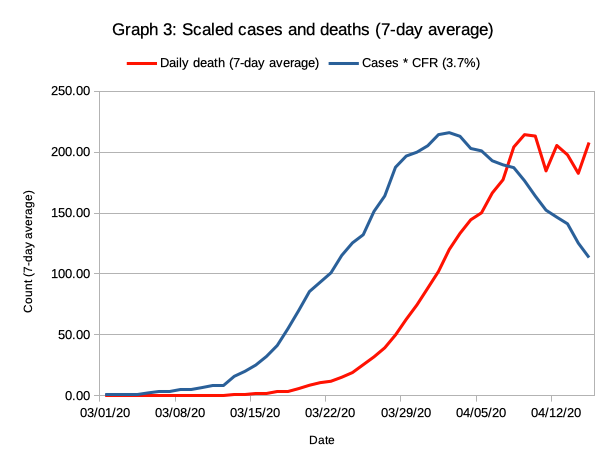 |
| Daily case numbers for Germany multiplied with the assumed CFR of 3.7% to match death rates |
By now, you probably have heard that the initial growth of the epidemic is exponential, and seen many plots that used a logarithmic scale for the y-axis. That's easy to do in LibreOffice, too. I then copied the graph into Preview and added a few lines:
 |
| Data from graph 3 using a log scale. Lines indicate region of steady exponential growth. |
Note that we can get exactly the same graph if we plot the log of the case numbers with a linear y-axis; the only thing that will change is the numbering of the y-axis:
Next, we'll let the spreadsheet program estimate the slopes of the lines during the exponential growth phase and during the decline phase. To do that, we separate the days we want to analyze together into separate columns: one from 3/6 to 3/18; and one from 4/9 to 4/15. Then, we can have LibreOffice insert "trend lines":
 |
| Estimating growth rates for the COVID-19 epidemic in Germany |
There's a bunch more fun to be had with the graphs. For example, you can extrapolate the initial growth line down to 10 cases or 1 case. You'll end up somewhere around February 20-26: the week after Karneval, which has been linked to one of the biggest outbreaks in Germany near Heinsberg. Other cities also had big parties in middle to late February, which apparently was a huge driver of very rapid exponential growth. The timing of the slowdown also matches the implementation of social distancing and other measures in Germany which started from March 10 to March 22, if a delay of 7-10 days between infection and reporting of results is taken into account.
How about the US?
Let's look at the graphs for the US: |
| Smoothed (7-day average) daily deaths and case numbers (multiplied with assumed CFR of 6%) for the US |
- The leveling and drop in cases per day is later and less pronounced than for Germany.
- Matching the curves required a CFR of 6%, about 65% higher than for Germany. The most likely cause is less testing in the US.
- The delay between case report and death is lower in the US.

However, it must be noted that there is a lot of uncertainty in this prediction. Even slight changes in the slope of the decline line would lead to large changes. The current trend in the case numbers seems to be more downward than the 7-day averages indicate, which would lead to a slower decline. On the other hand, there is a growing movement in many US states to stop the "stay-at-home" measures. This movement will lead to an uptick in new infections if some states lift the restrictions within the next 120 days.
For comparison, let us look at two other scenarios.
The first scenario is "leveling out": the new cases remain constant at the current level (for example because some states relax social distancing regulations). In this case, the predicted number of confirmed cases 4 months from now is about 4 million, leading to about 250,000 deaths.
In the second scenario, the US would quickly reach daily drops in new cases similar at the same rate as Germany. This would lead to a drop in daily new cases to less than 4,000 within a month, and less than 500 within two months. The total number of confirmed cases would be around 1 million, and the total number of COVID-19 deaths about 62,000. Reaching the drop of cases in this scenario would require regulations that are as efficient in stopping COVID-19 transmissions are the regulations in Germany are. While the regulation may appear similar to regulations in the US, there are many important differences. These include:
- Test, track, quarantine: Test rates in Germany are significantly higher, and delays to get test results are lower. Tracking of contacts of infected persons is generally done, and anyone with contact has to self-quarantine. Breaking quarantine rules is subject to substantial penalties.
- All public meetings are prohibited, and the rule is enforced by police. In contrast, most US states follow the federal guideline to allow meetings of up to 10 persons. Some US states have exceptions for religious and other purposes, and/or higher allowed numbers.
- The list of essential business that are allowed to continue operating is significantly stricter in Germany than in most, if not all, US states.
--
This post was inspired by a study that used an "interrupted time-series analysis" to look at the effects of social distancing measures in the US. The biggest differences are that my approach above is much less scientific, but pretty easy to reproduce by anyone who knows how to use spreadsheet programs; and that I specifically allowed for a "transition period" where the interventions are starting to take effect.
No comments:
Post a Comment
Note: Only a member of this blog may post a comment.